Background:
As The Paper Store introduced its highly successful Signature Store model—a reimagined brick-and-mortar concept—it became clear that the brand needed a creative evolution to match its elevated in-store experience. Long associated with traditional gifting and a Hallmark-driven identity, the brand was ready to shed the "your grandma's gift store" perception. With an expanded product assortment and a growing portfolio of trend-forward, sought-after brands, The Paper Store set out to reposition itself as a destination for discovery—a fun, vibrant retail experience that appeals to a younger, modern customer.
Brand DEVELOPMENT:
The transformation required a strategic brand refresh—one that could reintroduce The Paper Store to new audiences while retaining the emotional connection it had built over decades. My role was created to help guide that shift—developing a new brand voice, elevating the visual identity, and crafting campaigns that celebrate the joy of self-expression, style, and serendipitous finds. The goal? To make The Paper Store feel as relevant as it is nostalgic, and as inspiring as it is reliable—an everyday escape where every aisle sparks joy.
LOGO UPDATE:
The logo was evolved to support the brand's new direction—removing the gift box icon and shifting to a more approachable, less formal serif font. This update preserved the familiarity and recognition valued by loyal customers, while feeling fresher and more aligned with the modern customer they wanted to attract.

Color Palette:
The color palette was developed to balance approachability with energy. The primary neutral tones create a calming, grounded backdrop, while the vibrant secondary colors introduce pops of brightness and cheer—capturing the optimism and spirit of the brand in a way that feels both intentional and uplifting.

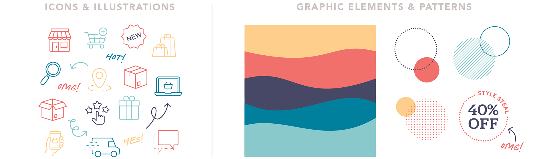
Icons & Graphic Elements
The iconography and graphical elements were designed to feel playful, energetic, and joyfully human. Inspired by the dopamine design trend, we embraced bright pops of color, organic shapes, and expressive forms to create visuals that spark happiness and connection.
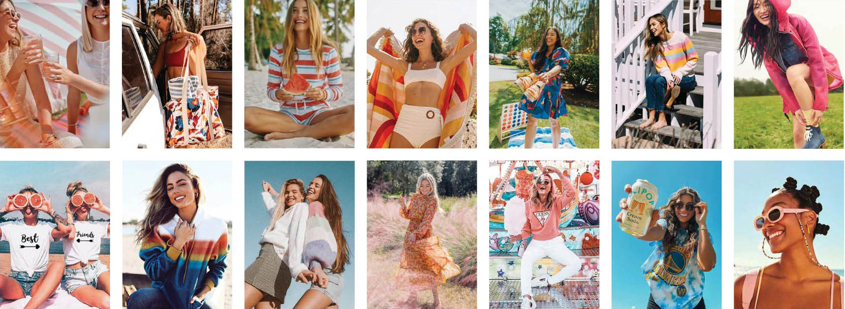
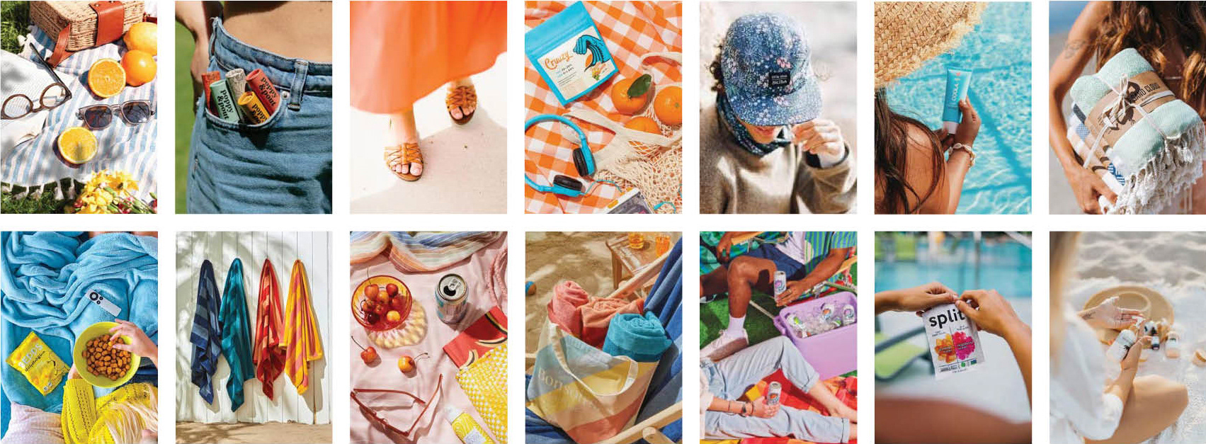
Imagery and Photography
The imagery is intentionally bright, cheerful, and full of life—designed to reflect the genuine joy The Paper Store brand stands for. Whether it’s on-model or product-focused photography, every image is crafted to feel warm and authentic.
MODEL Photography
Each image tells a story of delight and connection—laughter, excitement, and the simple joy of being present which allows customers to feel the emotional impact of the brand.
In-studio product photography
The in-studio product photography features bright, colorful pops that not only highlight each item but also reflect the essence of the season.

On-location product photography
Retaining the brightness of the in-studio shots, these images show the products in use—enjoyed, shared, and part of everyday adventures.
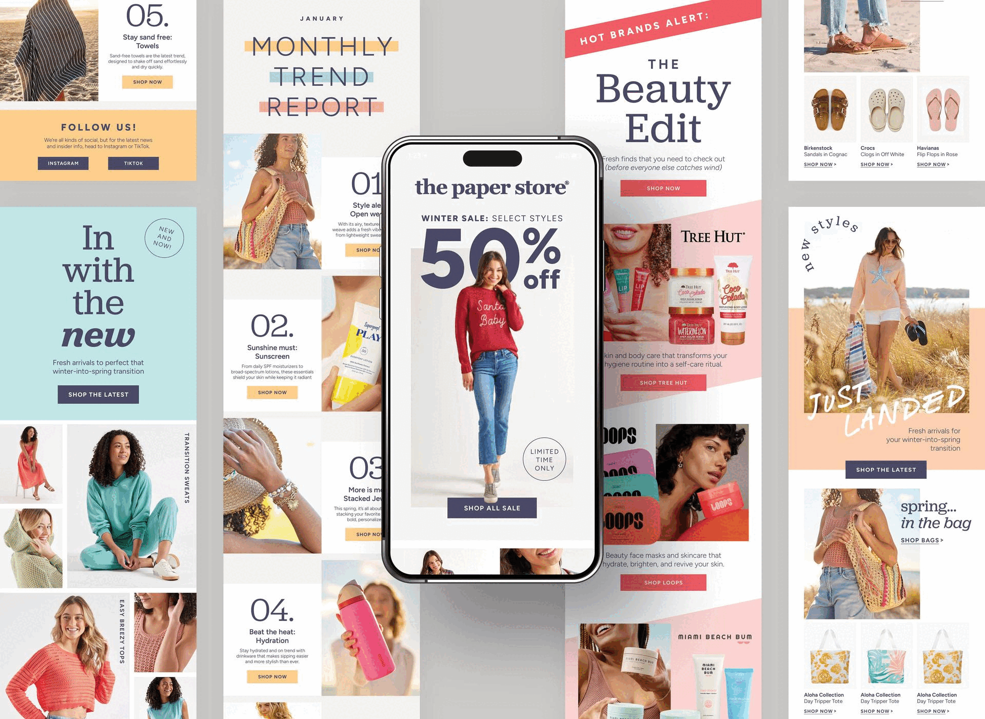
MARKETING EMAIL DEVELOPMENT:
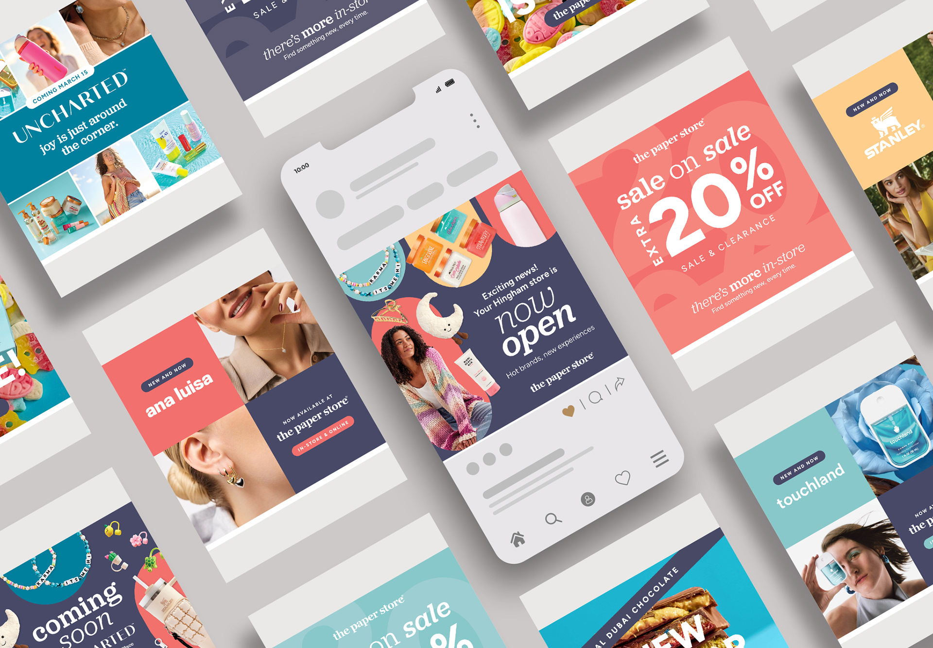
I led the development of new email templates that brought storytelling and a thematic approach to the forefront. Working closely with the email marketing team, we shifted emails from purely promotional to content that showcased our expert point of view—exciting customers about what's trending today and tomorrow, while guiding them toward must-know products and styles.
Paid Digital DEVELOPMENT:
I led the development of paid digital ads that spotlighted new and trending products while driving a strong sense of urgency. These campaigns positioned us as a destination for the hottest, most viral products on the market—creating excitement and prompting quick action, all while reinforcing our relevance.
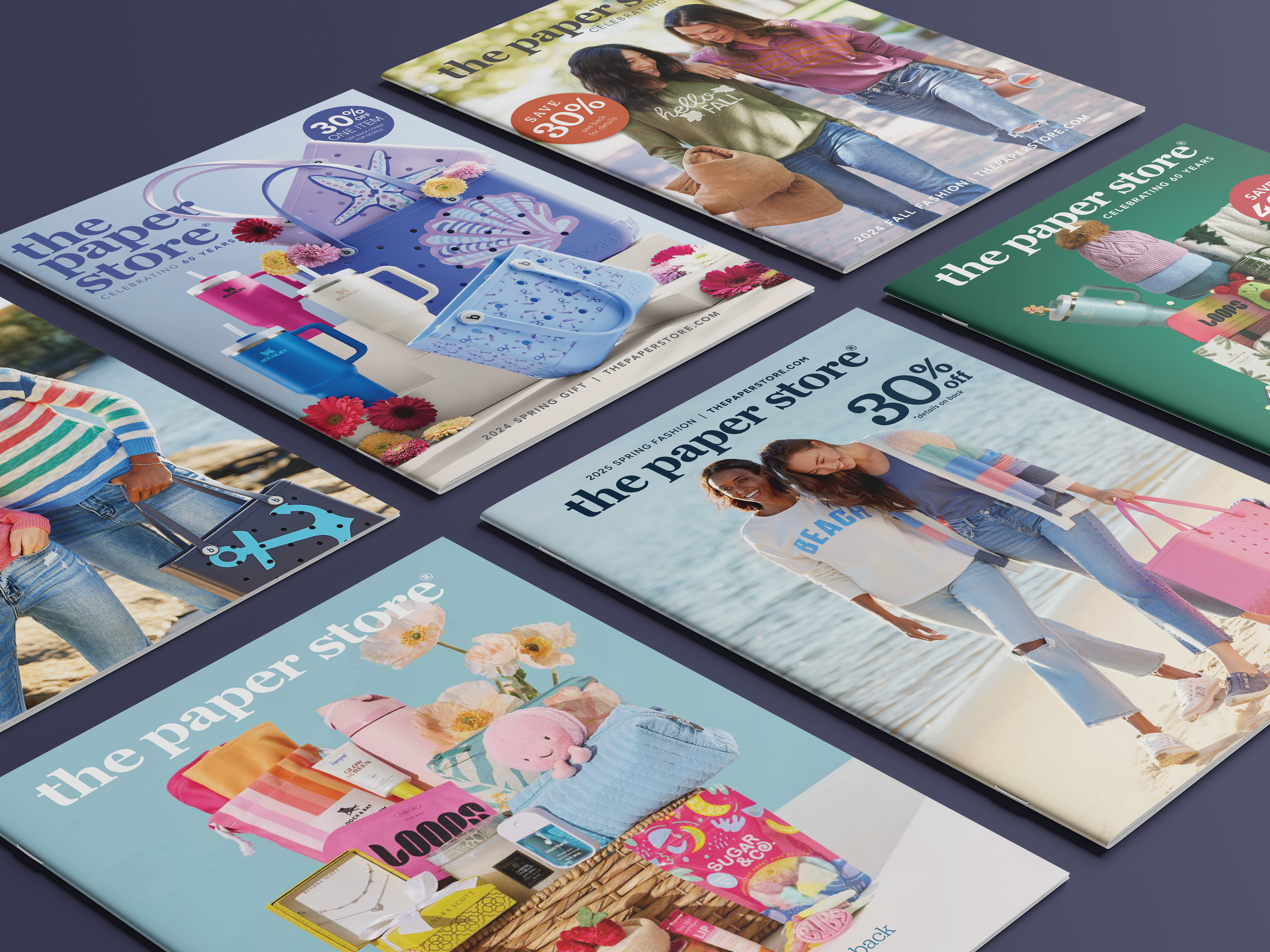
catalog & direct mail evolution:
I led the evolution and development of seasonal themes and content for The Paper Store’s catalog and direct mail programs, driving 13 individual sends per year. Our approach shifted to include richer storytelling, updated visual styles, and a sharper focus on the products and brands that made The Paper Store stand out in a crowded retail landscape. Each piece was crafted to create a stronger emotional connection with customers while reinforcing what made our assortment truly unique.


Developing the Uncharted Brand
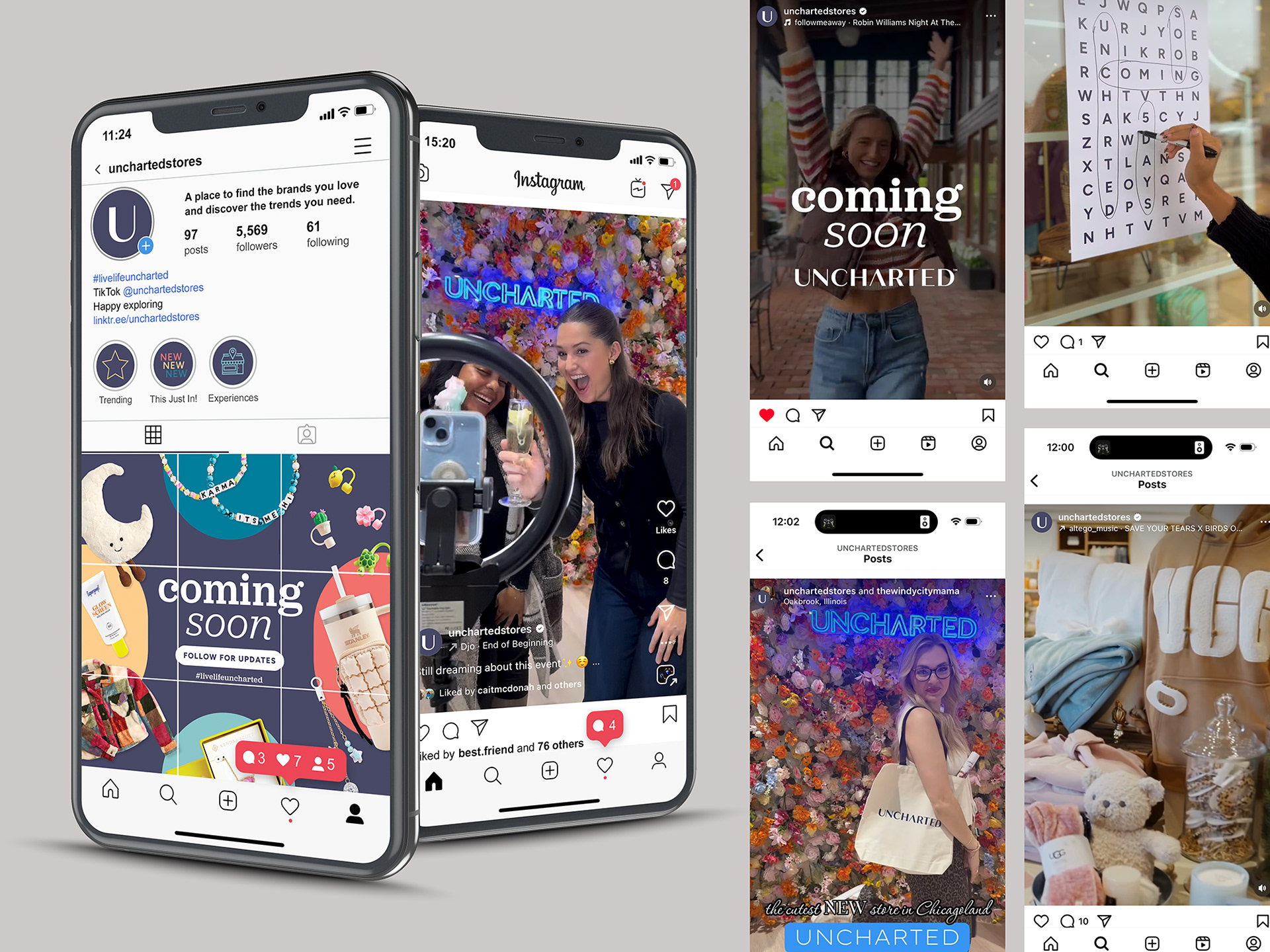
I led the creation of Uncharted, a new sister brand for The Paper Store, developed to support the company’s expansion into the Midwest—where brand recognition was limited and the original name suggested a narrow, outdated offering. This was not only a strategic response to a new market, but also an opportunity to evolve a 60-year-old brand into something that reflected who they are today. Uncharted made its debut in Oak Brook, IL in November 2024, kicking off The Paper Store’s next chapter. The launch exceeded expectations, with sales hitting 400% to goal in the first two weeks. Today, there are four Uncharted locations—three in Illinois and one on the East Coast in Greenvale, NY.
What's in a name?
Choosing the right name was vital to the success of the sister brand. We knew it had to resonate with new customers, reflect the evolution of the business, and align seamlessly with the “Discovery of Joy” brand platform we were building. The process began by crowdsourcing name ideas from employees across the organization—including store associates—bringing in a wide range of perspectives and insights. After extensive exploration, Uncharted rose to the top—a name that captured the spirit of exploration, delight, and possibility. Here are some of the visualizations created during that naming journey.


Launching Uncharted
Through a mix of PR, influencer partnerships, email, social media, and grassroots outreach, we built buzz and anticipation leading up to the opening of the first Uncharted store. These efforts paid off—drawing in eager, excited customers from day one and setting the tone for a strong, community-driven brand presence from the very start.
Email campaigns

Social Media Campaigns
The Joy Effect: A Brand Campaign
The Joy Effect was a brand campaign rooted in the idea that joy is contagious—and that our stores are places where that joy begins. Built to reflect our core mission, the campaign showed how a single spark of happiness in-store could ripple outward to family, friends, and even strangers. Both The Paper Store and Uncharted were positioned as joyful escapes from the noise of everyday life—a haven from to-do lists, bad news, and daily routines.
To bring the concept to life and inspire internal teams, I developed a proof of concept video using stock video that visually captured the emotional heart of the campaign. It became a powerful tool to onboard teams, align creative efforts, and show how small, thoughtful moments in our stores could create lasting impact.
Brand pitch materials:
I created a B2B pitch deck that reintroduced The Paper Store brand to prospective partners, helping the buying team present a fresh, compelling case for why national brands should sell their products in our stores. Designed to showcase our reach, customer base, and brand alignment, the deck became a key tool in onboarding major names like The North Face, Marine Layer, Crocs, and Birkenstock—strengthening our product assortment and elevating our in-store experience.